A quick overview of the topics covered in this article.
Subscribe to the UKPACK newsletter to receive regular updates on the company, products, services, upcoming exhibitions and more.
Skincare has become more than just a routine—it’s an experience, a self-care ritual that goes beyond the product itself. In the ever-evolving beauty industry, packaging plays a crucial role in capturing attention and conveying the essence of a brand. With countless skincare products on the market, it takes something truly exceptional to stand out from the crowd.
In this blog post, we delve into the world of creative skincare packaging design. We’ve curated a list of the top 10 creative examples that not only catch the eye but also encapsulate the brand’s identity and enhance the overall skincare experience. From bold and vibrant designs to minimalist and elegant aesthetics, these packaging designs push boundaries and redefine the concept of beauty.
Join us as we explore these outstanding examples, each a masterpiece in its own right. Discover the symbiotic relationship between form and function, where creativity meets practicality. Get ready to be inspired by the imaginative use of materials, captivating illustrations, and ingenious structural designs. Whether you’re a skincare enthusiast, a packaging aficionado, or simply someone who appreciates the artistry behind every product, this blog post is a must-read.
Let’s dive into the world of top-tier creative skincare packaging design and unlock the beauty that lies within each stunning creation. Prepare to be amazed and delighted by these exceptional works of art that elevate skincare to new heights.
Are you ready to embark on this visual journey? Let’s explore the top 10 creative skincare packaging design examples together.
1. YOU & OIL Natural Cosmetics
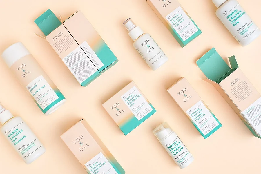
YOU & OIL Natural Cosmetics has designed a new logo and packaging for their natural cosmetics line. Their aim is to create a professional and natural image for the products. Here are the key design features:
- Product Differentiation: They have categorized their products into five color-coded lines based on their effects: balance, energy, nutrition, calming, and products for men.
- Competence: They have redesigned the logo, using white “pharmaceutical” rectangles and lab-style numbering to convey expertise and reliability.
- Oil Effect: They have used intensive color gradients to symbolize the nourishing effects of oil on the skin.
- Sensory Effect: The soft touch finishing on their packaging conveys the sensation of healthy skin.
The modern and understated appearance of YOU & OIL Natural Cosmetics gives the impression that their products are scientifically formulated by experts in a lab. The use of a simple sans serif font adds a professional touch, while the color gradients not only add energy but also help customers differentiate between the various product varieties. The gradients also evoke a sense of transformation, which is often the desired outcome when people search for the right skincare products. Moreover, by avoiding specific illustrations or images, their brand is clearly intended for both men and women, expanding the reach of YOU & OIL to a wider audience.
2. Feel Skincare

Beauty companies often rely on intricate and decorative designs for their product packaging. However, choosing a simpler design can make your brand stand out. In fact, simplicity in packaging design often signals the use of natural and organic ingredients, which many people prefer in their personal care products.
This skincare product line embraces an elegant and refined packaging design concept. While using different colors for cosmetics packaging can help differentiate between products, opting for a single color can create a strong brand identity. For this vegan and cruelty-free beauty brand, the choice of a natural color (resembling skin tone) not only represents a focus on high-quality ingredients but also avoids flashy packaging that might overshadow the product itself.
3. Oh La La Lip Balm
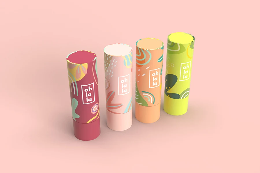
While skincare products often benefit from minimalistic and “organic” packaging, lip balms allow for a bit more creativity in their presentation.
This fantastic packaging concept for beauty products exudes playfulness and trendiness. The vibrant colors and delightful illustrations bring a lively touch to the design, yet it manages to avoid being overly noisy or outdated. The minimalist beauty logo blends seamlessly with the colorful packaging. Each packaging option corresponds to a unique flavor or scent of the lip balm, providing a delightful and varied experience for consumers.
4. Ozmetics
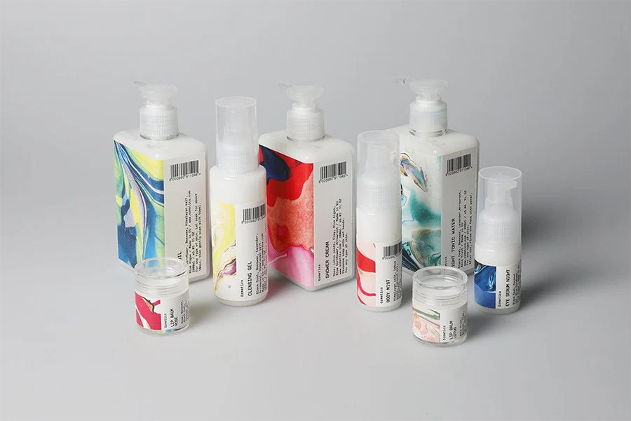
Sara Ozvaldic has created captivating packaging for Ozmetics. The design showcases stunning marbled imagery that highlights the meticulous combination of ingredients in each product.
“Personalization is crucial in skincare, as it caters to the unique needs of individuals and fosters a sense of connection with the product. Our brand identity celebrates the concept of tailor-made cosmetics, where clients select ingredients for each product. The name Ozmetics cleverly plays with the word ‘cosmetics,’ elongating the pronunciation of the letter ‘o.’ The diverse handmade marble prints symbolize the fusion of various natural ingredients. Clients receive a personalized label design reminiscent of a customized polaroid picture, enhancing their identification with the product.”
5. Prana
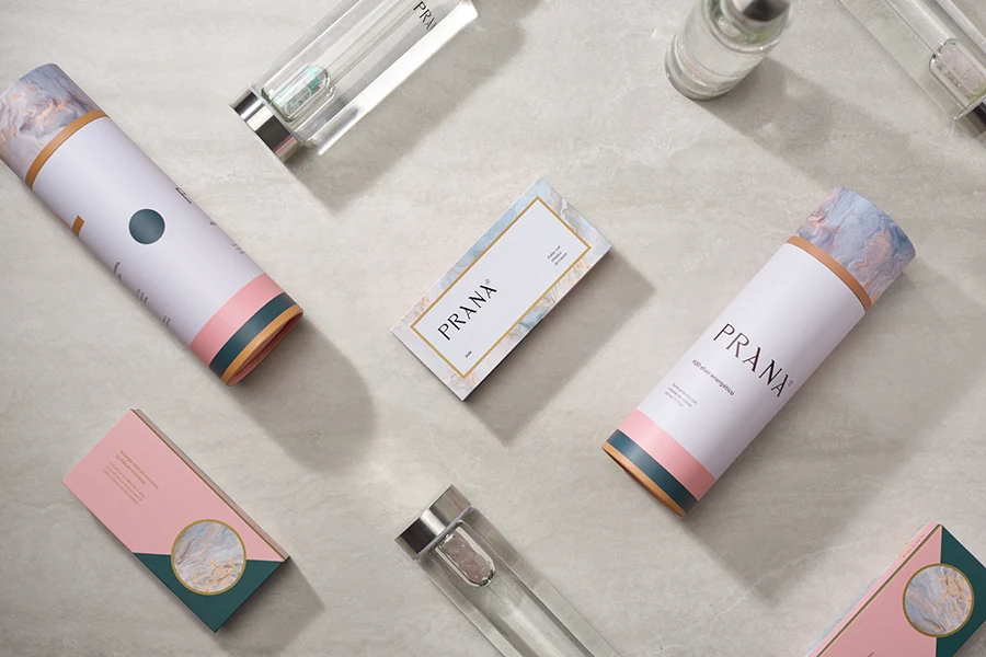
While sustainability remains a significant packaging trend, capturing the attention of high-end clients also requires a luxurious packaging design.
Whether it’s a gentle micellar water cleanser or a range of hair care products, this beauty packaging exudes a feeling of opulence and refinement. The minimalist design conveys a sense of purity and well-being, while the understated marble pattern adds a touch of sophistication to this bespoke packaging.
6. Aquatadeus
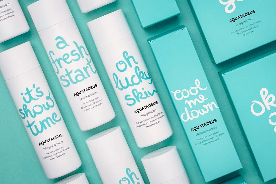
Experience a refreshing start for your skin every day with Aquatadeus, a skincare line designed by moodley brand identity. This rejuvenating collection aims to heal and revitalize your skin, unveiling a natural and radiant glow. The brand’s identity is wonderfully invigorating, featuring a vibrant color palette and a playful font choice, creating a delightful way to begin your mornings.
“Since the 17th century, mankind has recognized the therapeutic power of healing water. Aquatadeus now incorporates this healing essence into their skincare line, which revitalizes and restores the skin’s well-being. Following moodley’s rebranding, the corporate design mirrors this newfound sense of rejuvenation.”
“Optimistic, natural, and sincere—these words perfectly capture the essence of Aquatadeus. Through their natural skincare range, the brand aims to demystify neurodermatitis and foster open and honest communication. This self-assurance is now at the core of the brand’s new identity and packaging design.”
7. Lucid Skincare

This packaging concept belongs to a skincare line infused with cannabis and features creatively designed packaging. From spacious containers for body lotions to droppers filled with skincare oil and other formulations, these beauty packages possess a distinct and exceptional appearance. The intention is to evoke a sense of euphoria and lucidity, emphasizing that indulging in a little self-care can have remarkable benefits.
8. VITA

By employing impactful lettering and a clean aesthetic, VITA exudes the essence of a product crafted within the pHformula laboratory. The pill-shaped bottle design is remarkable and distinctive, ensuring that the products effortlessly stand out on store shelves. Moreover, it aligns perfectly with the company’s vision: where skincare meets healthcare. The off-center placement of the facial cream names (A, B3, and C) prevents pHformula from appearing overly clinical, while conveying a sense of innovation within the company.
“The end result is a range of three products that not only stun with their packaging but also captivate with their capsule flask design, effectively boosting sales. These exclusive items are available solely in beauty and medical centers worldwide. Through our design, we aim to attract the attention of clients visiting these establishments, which typically offer monochromatic and austere product selections.”
9. Metrin

While maintaining the original METRIN® color scheme of white, black, and gold, they have implemented a more refined approach by incorporating key line strokes and a contemporary sans-serif headline font. Additionally, they introduced a secondary texture palette inspired by raw materials such as Marble, Plywood, and Dark Concrete, establishing a connection between the natural ingredients and earthy, organic tones.
The METRIN® product range follows a step-by-step regimen, utilizing separate bottles for each stage. To enhance the packaging, they have revamped it with a custom set of stenciled numerals. These numerals strike a balance between the traditional elements of the logo and a modern aesthetic, aligning with the brand’s aspiration for a fresh and updated look and feel.
10. Snejana Hill Cosmetics

Snejana Hill Cosmetics offers a range of lotions, creams, masks, and oils that draw inspiration from nature. Suprematika has skillfully designed the packaging to honor the pure ingredients used in each product, highlighting their natural goodness.
The cosmetics line, which prominently features the prefixes “Organics” and “Bio” for its 90 percent natural ingredients, is aptly named “Inspired by Nature.” It pays homage to the objects found in nature that serve as Snejana’s inspiration for creating these cosmetics. The products from the line “Inspired by Kyoto” are meticulously handcrafted near the scenic Japanese city and Mount Fuji.
Snejana Hill Cosmetics utilizes a clean white backdrop adorned with subtle and delicate illustrations. This creates a light and airy ambiance, allowing consumers to enhance their natural beauty effortlessly. The imagery is reminiscent of charcoal or thick pen drawings, conveying the careful craftsmanship involved in creating each product by hand. The brand’s logo cleverly combines the initials, presented in a contemporary sans-serif font that exudes a cutting-edge vibe. Descriptions of each product feature a traditional serif font, enhancing the overall “inspired by nature” and grounded approach.
The Inspired by Kyoto line showcases stunning colors inspired by the majestic Mount Fuji, infusing each item with a unique and vibrant personality. The packaging offers a glimpse of the mountain’s overall image, igniting the consumer’s imagination. The bottles and jars maintain a consistent white hue, aligning with the brand’s overall aesthetic.
Conclusion
In conclusion, the world of creative skincare packaging design is a realm of limitless creativity and innovation. Throughout this blog post, we’ve showcased the top 10 examples of exceptional packaging designs that not only captivate the eye but also enhance the overall skincare experience. From bold and vibrant designs to minimalist and elegant aesthetics, each packaging design has demonstrated the power of visual storytelling and its ability to elevate a brand’s identity.
As we’ve explored these remarkable examples, it’s evident that skincare packaging has become an art form in its own right. The meticulous attention to detail, the ingenious use of materials, and the harmonious fusion of form and function all contribute to an elevated consumer journey.
If you’re in search of creative skincare packaging that leaves a lasting impression, look no further than UKPACK. As a professional cosmetic packaging supplier in China, we possess the expertise and experience to bring your vision to life. Whether you’re seeking unique shapes, innovative materials, or custom designs, UKPACK can provide the creative skincare packaging design solutions you need to make your skincare products truly stand out.
Embrace the power of packaging design and elevate your brand’s skincare offerings. With UKPACK as your partner, the possibilities are endless. Contact us today to unlock a world of creative skincare packaging possibilities.

Lucas Ji, Founder of UKPACK and Chief Packaging Designer, has 15 years of experience designing sustainable packaging for global beauty and beverage brands. His Red Dot Award-winning solutions have helped 50+ premium brands transition to eco-friendly packaging.

